
Travel Website Optimization
Wayfarer is a trip-planning platform which suggests travel destinations and hidden gems to inspire wanderlust in the 21-30 year-old traveler. Their brand identity culture centers around inclusivity, inspiration, and innovation.
The Challenge
The Wayfarer website has been underperforming for a while; users are unclear of Wayfarer’s features and how the platform works. Wayfarer needs an update to the homepage of their website (for both desktop and mobile), not only in terms of visual appeal, but also in the user’s navigation of the website and educating users on the functionality of the platform itself.
Research
In today’s digital world, there’s a significant influence online and on social media platforms, which younger generations turn to for inspiration and ideas for travel planning. According to 2023 research from Skift, “Millennials and Gen Z are steering travel trends with a focus on technology, sustainability, and a quest for distinctive and meaningful experiences.” Furthermore, according to researcher Eran Ketter, Millennials are specifically setting four tourism trends: creative tourism; off-the-beaten-track tourism; alternative accommodation, and fully digital tourism. This influenced my decision to feature the key product benefits of Wayfarer that correlate to Millennial and Gen Z travel trends - including the AI algorithm which suggested unique travel experiences based on their preferences, the ability to share travel plans on social media, and accessing Wayfarer across tech devices. In addition, given their focus on finding meaningful travel experiences, I wanted to emphasize a range of accommodation options and activities in the Wayfarer multi-step intake form, to suit the range of interests of Gen Z and millennial travelers.


Solutions
Wireframe
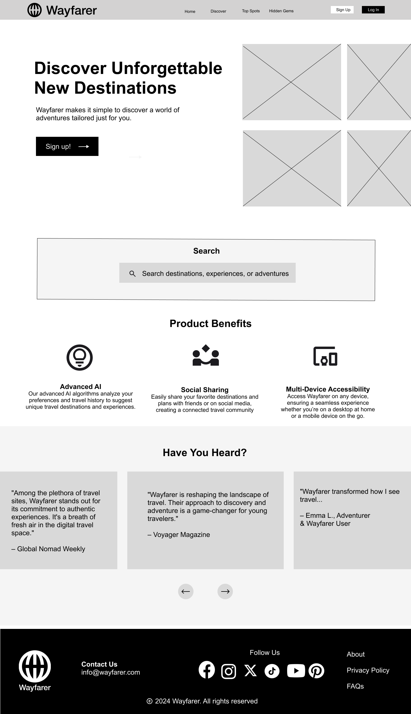
This is the mockup design I selected from my sketches. I wanted to incorporate some travel photos, as well as icons for the product benefits that set Wayfarer apart. For some engagement, I wanted to include a carousel for the media testimonials. Moreover, the testimonials would solidify the validity of Wayfarer and provide reputable evidence for users, especially new users, of the benefits Wayfarer can provide them.
Style Tile
I selected a color scheme and typography style to match Wayfarer’s brand identity. I went with warmer colors not only to coordinate with my hero image, but also to convey friendliness, calmness, and approachability, balanced with luxury from the use of black.

Home Page Iterations:
These are a few versions of the homepage designs, in which I made changes to the color scheme, the presentation of images, and the iconography.
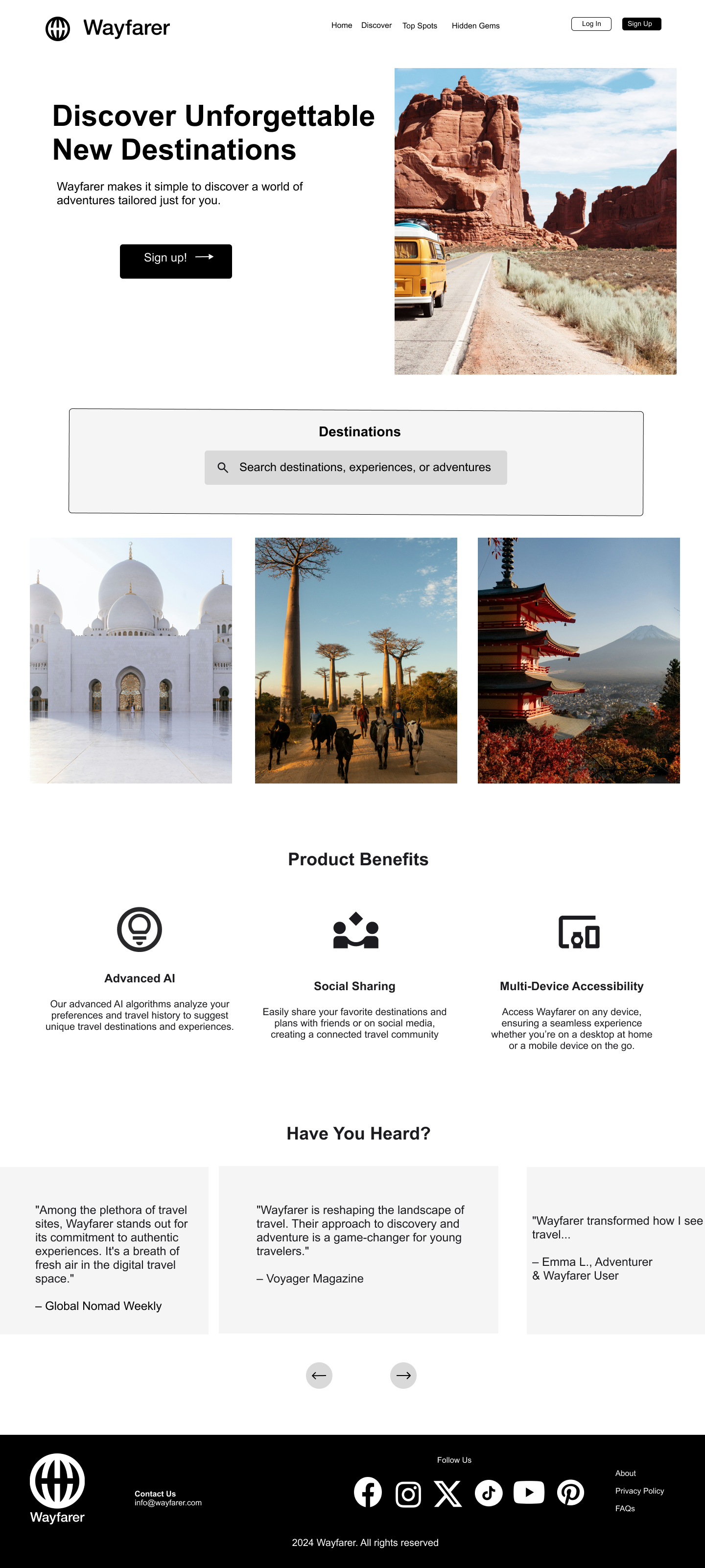
In contrast to the wireframe, I decided to include one focal hero image rather than four smaller images at the top. Instead I would incorporate more images in the center of the site.

In this iteration, I experimented with spanning the hero image across the top. As a result, I changed the hero text from black to white so that the text would be legible on top of the image. I also incorporated the mustard color into the icons and first CTA (sign up) button to correlate with the color of the van. I added borders around the product benefits to make them distinguishable as cards.
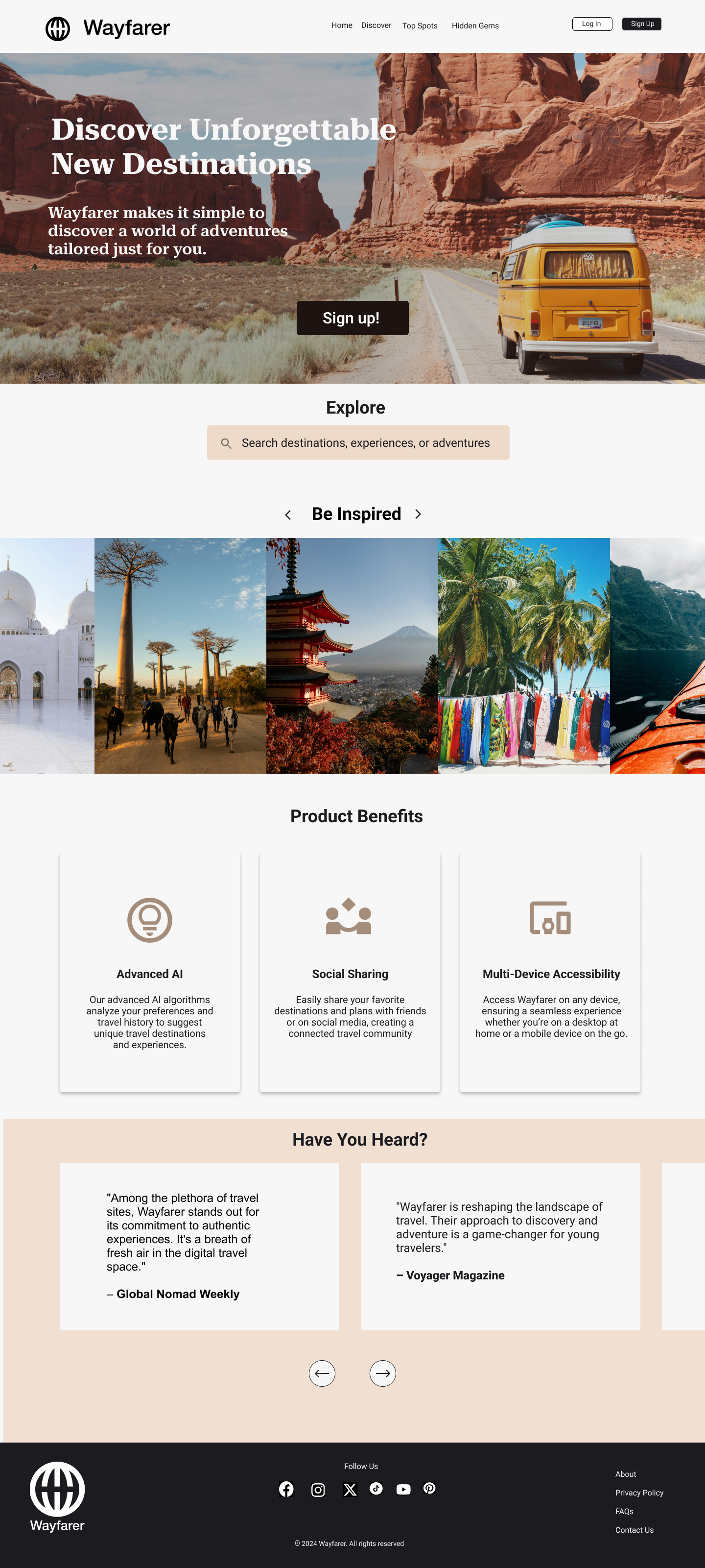
As I got closer to the final iteration, I experimented with color once again, swapping the mustard yellow for beige and cream colors. I updated the images to refelct a gallery for users to flip through (as indicated by the arrows) for some interactivity and to spark inspiration, as opposed to having a few static photos in my past interactions.
Final Results
In my final version, I added some more photos to feature a variety of destinations to suit different travel styles and preferences. I also included logos or photos in the testimonials to make the testimonial cards stand out.

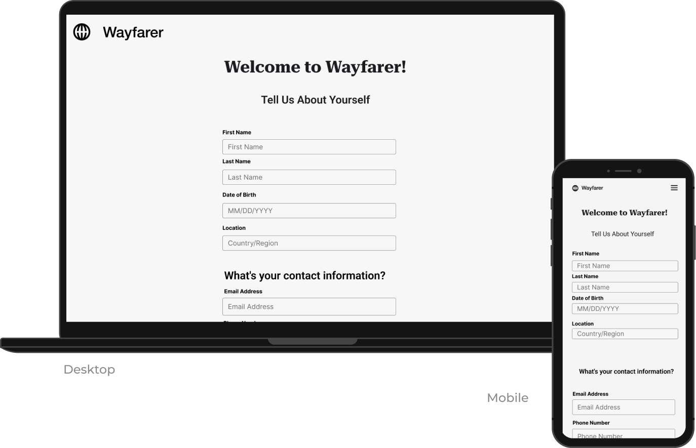
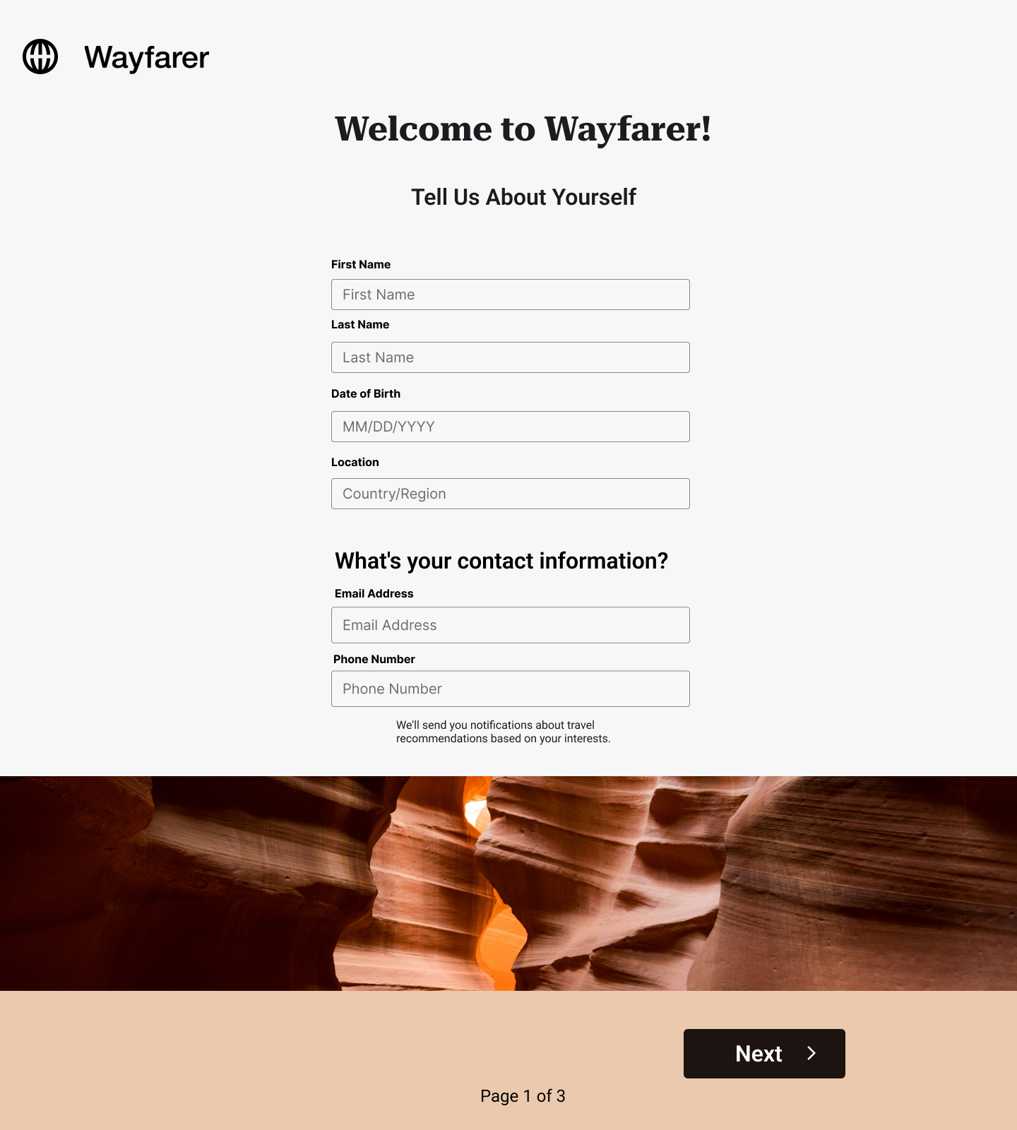
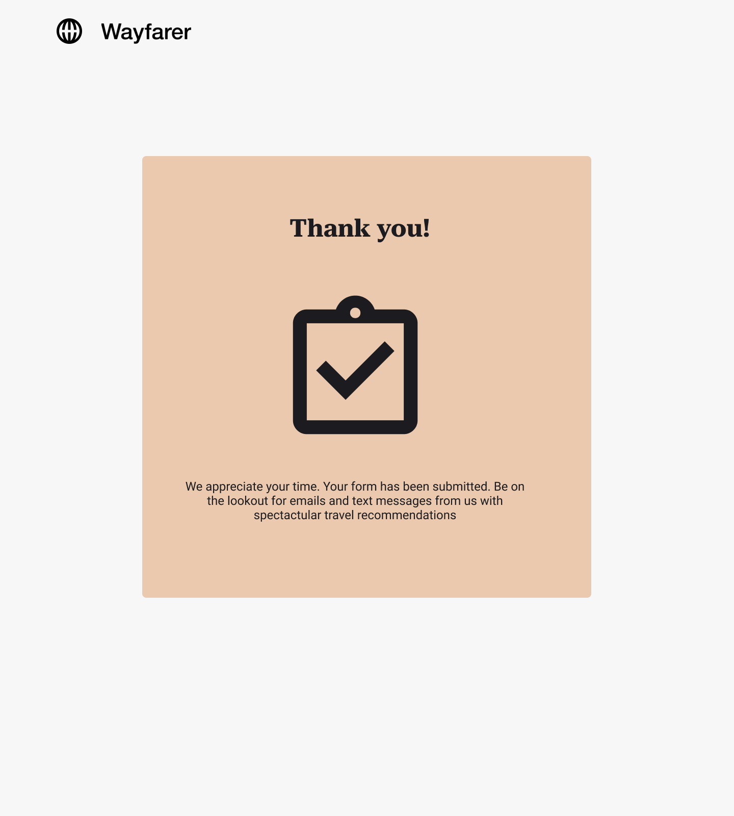
Multi-Step Form
I created a multi-step form to collect personal information from Wayfarer users that will in turn create a customized experience with recommendations based on their preferences. I incorporated a few components - including switches, radio buttons, check boxes, and dropdowns to make an interactive, intuitive, and enjoyable experience for users.


Reflection
Overall I enjoyed the process of designing the web pages and forms for Wayfarer. It was a great opportunity to become more familiar with Figma. It’s also interesting to see my designs from start to finish, and the ways they changed that I didn’t even anticipate.